Guide · · 18 min read · By Rayen Bahri, Saved Pixel
Friendslop Art Style: How to Make PEAK-Style Game Assets in Blender
TL;DR: The "friendslop" look (PEAK, R.E.P.O., Lethal Company, Content Warning) is not just low poly. It is a production strategy: readable silhouettes that survive multiplayer chaos, a strict color hierarchy where players outshine the world, a small prop kit reused everywhere, simple graphic faces, and flat colors or soft gradients instead of painted surface detail. In Blender that means chunky faceted modeling, one shared palette texture for the whole game, and one cheap post-process pass in the engine. This guide covers the rules, a character, a prop, a full kit, biome variants, the engine pass, and a four-week art plan.
What "friendslop" means, and why the art matters
"Friendslop" is the tongue-in-cheek label players gave to cheap, chaotic co-op games built to be played with friends: proximity voice chat, physics everywhere, low stakes, and a price low enough that one person buys it and three friends follow. Among Us is usually named as the ancestor; Lethal Company (2023) and Content Warning (2024) set the template; and in 2025 PEAK, R.E.P.O., and RV There Yet? turned it into one of the biggest trends on Steam. In 2026 the release list keeps growing.
The numbers explain why so many small teams are chasing it. PEAK began as a one-month game jam project between Aggro Crab and Landfall in February 2025, launched in June, and passed 10 million copies by mid-August. It was built in Unity by a small team with a stylized, low-fidelity art style that a handful of artists could produce in months, not years.
That last point is the part most "what is friendslop" articles skip. The art style is not an accident of budget. It is doing specific jobs:
- Clarity: it keeps chaotic four-player scenes readable.
- Marketing: it makes every clip instantly legible on TikTok, Twitch, and Reddit, which is where these games are discovered.
- Reach: it runs on your friend's old laptop, and a co-op game is only bought if the whole group can run it.
- Scope: it lets a tiny team ship in months.
If you understand those jobs, you can build the look deliberately instead of just making things "low poly".
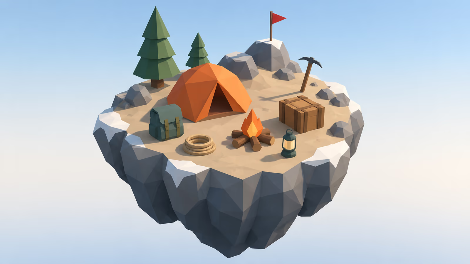
The five rules of the friendslop look
1. Readability beats detail, every time
In a co-op game, the camera is rarely framed nicely. Four players are shouting, someone is falling, a monster is behind a door, and a physics object is spinning through the air. Players need to understand the scene in a fraction of a second: who is who, what can be grabbed, what is dangerous.
That means silhouette first. Characters and interactable props should be recognizable as a solid black shape. R.E.P.O.'s bean-shaped robots with oversized eyes are a perfect example: you can identify a teammate from across a dark room by outline alone.
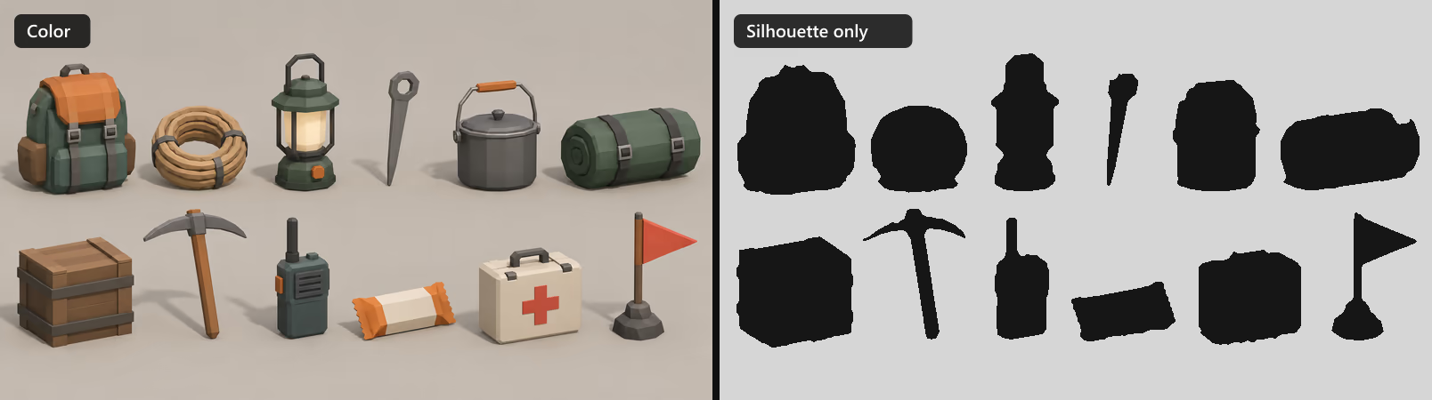
Run the same test in Blender in ten seconds:
- Open the Viewport Shading popover (Solid mode).
- Set Lighting to Flat and Color to Single, then pick black.
- Set Background to Viewport and pick white.
Now orbit around your kit. Anything you cannot name by outline needs a more distinctive shape: exaggerate the handle, the head, the antenna, the one feature that makes it that object. Notice in the image above how the crate and the first-aid box collapse into the same rectangle; in a real game you would give the first-aid box a bigger handle or a rounded, pill-like case.
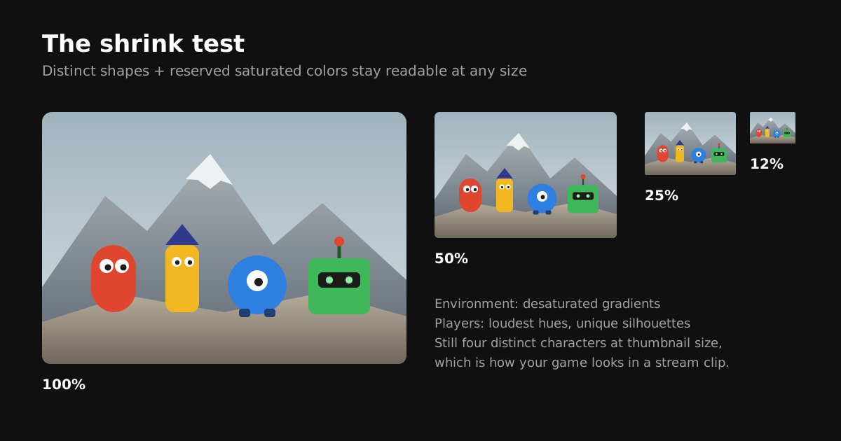
2. A strict color hierarchy
This is the rule that separates good-looking friendslop from muddy friendslop. Assign saturation like a budget:
- Players: the most saturated, most distinct hues in the game. PEAK's scouts wear bright, clearly different colors so you can find your friends on a mountainside.
- Interactables: one shared accent color, so "grabbable" reads as a category, not as a list of objects to memorize.
- Environment: desaturated, value-driven, and dominated by soft gradients that shade large shapes.
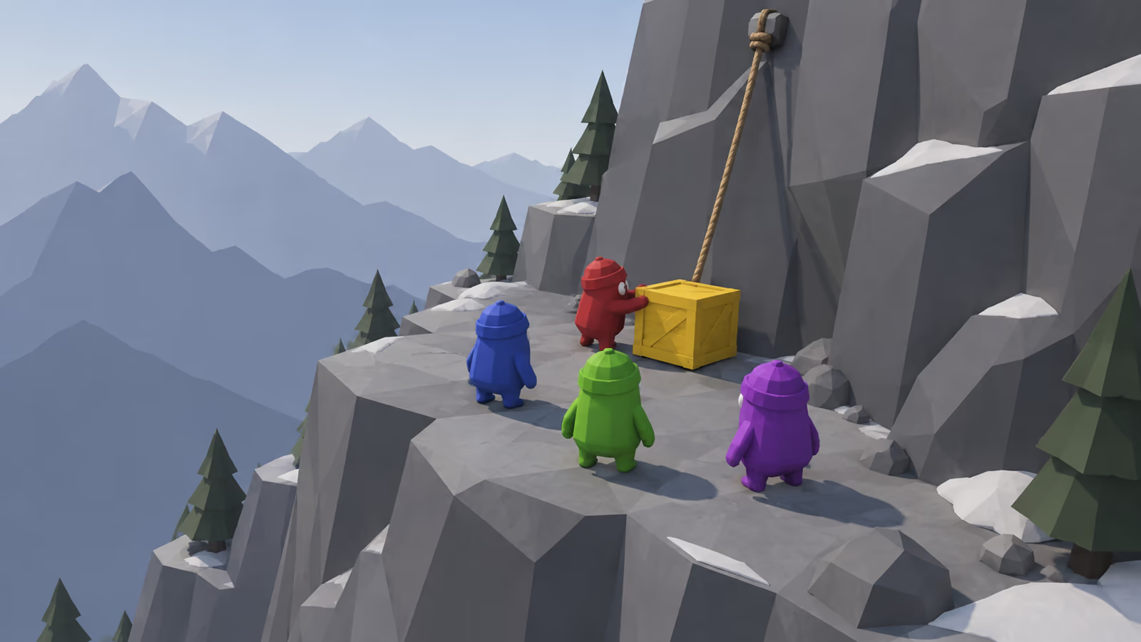
There is a second check that catches problems hue alone hides: value, meaning how light or dark something is. Convert a screenshot to grayscale. If your players disappear into the rocks in grayscale, they will also be hard to spot for color-blind players and in dim scenes, even if the hues look different.
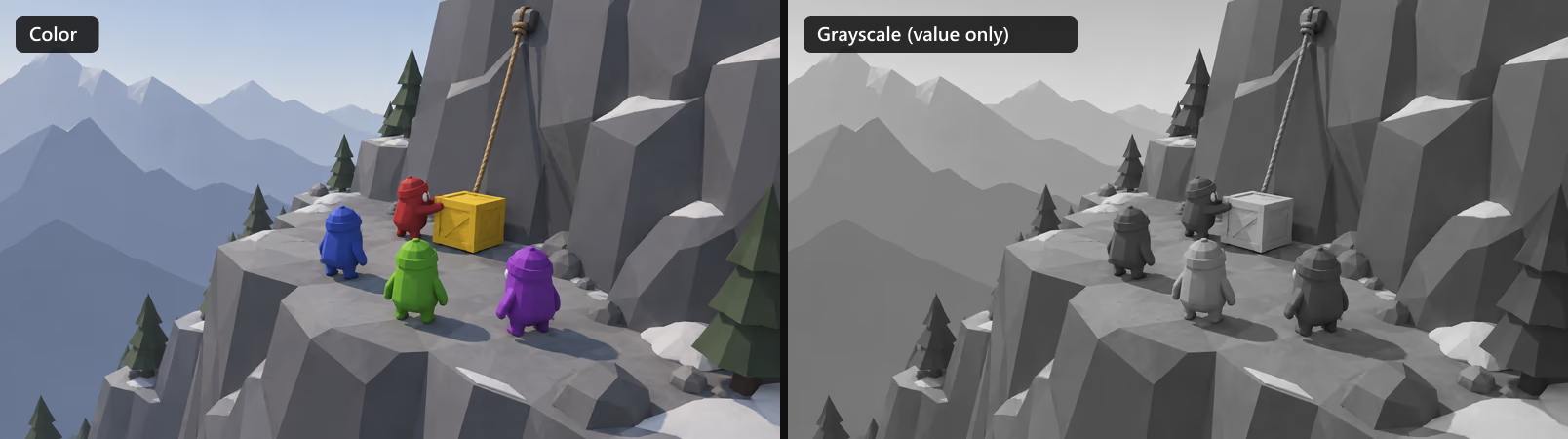
That is a real failure the color version hides. The fix is not new hues but new values: lighten one of the dark suits (a pale pink or sky blue instead of red or blue) so each player sits at a different point between dark and light.
Pick player colors in pairs of light and dark (for example a light yellow-green and a deep blue, a bright orange and a dark purple). Hue plus value separation keeps teammates distinct for every player, including the roughly one in twelve men with some form of color vision deficiency.
3. Few assets, many situations
Friendslop games produce endless memorable moments from a surprisingly small asset library, because the variety comes from physics and players, not from content volume. A dropped crate, a rope that snaps, a lantern that rolls off a ledge: each prop is a toy that interacts with every other toy. For artists that means a kit mindset. Make 20 props that work together and look like one family, rather than 200 one-offs.
4. Flat color and soft gradients instead of surface detail
Painted grain, scratches, and normal-mapped wear fight rule 1: they add visual noise at exactly the scale where the player needs clarity. The friendslop look relies on flat color fills plus gentle gradients that do the shading (dark at the bottom of a rock, lighter at the top). This is gradient texturing, and it is why a whole game can share one tiny palette texture.
5. Faces and motion carry the comedy
The humor in these games comes from animation, ragdolls, and faces: big eyes, simple mouths, lip sync driven by voice chat. Keep faces graphic and simple so they read at distance and can be animated cheaply. The next section shows how.
What to learn from four breakout games
| Game | Visual signature | What to take from it |
|---|---|---|
| PEAK (2025) | Bright stylized mountain biomes, colorful scouts, big readable climbing surfaces | Color hierarchy: saturated players against softer, gradient-shaded terrain |
| R.E.P.O. (2025) | Bean-shaped robots with huge eyes, physics valuables | Silhouette and face design that stays readable and funny in the dark |
| Lethal Company (2023) | Low internal resolution, heavy post-processing, dark industrial spaces | A cheap screen-space filter can unify simple assets into a strong mood |
| Content Warning (2024) | Simple cartoon characters under a grainy found-footage camera filter | Keep assets simple and let one stylized camera treatment do the heavy lifting |
Notice the pattern: none of these games relies on detailed textures. The assets are simple, and the identity comes from shape language, a controlled palette, and one strong rendering decision.
Designing a friendslop character
The player character is the most important asset in the game: it appears in every clip, every thumbnail, and every screenshot. It also has to ragdoll, carry things, and emote, so the design has to be simple enough to animate cheaply.
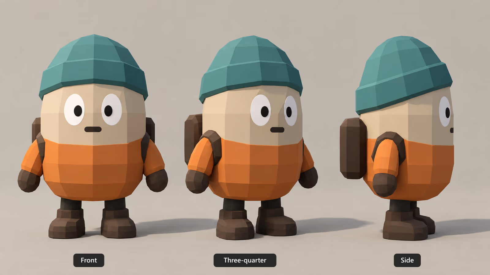
Body: one primitive, two heads tall
- Start from a single capsule or bean. No neck, no shoulders, no waist. The head and body are the same shape, which is why these characters ragdoll so comically: they tumble like a bottle.
- Two to two and a half heads tall. Short, wide proportions read as cute and clumsy, and they keep the face large on screen.
- Add one silhouette breaker. A hat, an antenna, a backpack, a helmet lamp. It is what makes the character recognizable from behind, which is how teammates usually see each other.
- Stubby limbs as separate pieces. Mitten hands and chunky boots as separate meshes are easy to rig with a handful of bones and hide the joints during ragdoll.
Color: the body is the player slot
Put the jacket or body on its own palette zone and make that zone the thing the engine swaps per player. With a shared palette texture that is a UV offset or a tiny material property, not a new texture per player. Keep the hat, boots, and backpack in shared neutral colors so the per-player color dominates.
Face: a face atlas instead of facial rigging
Detailed facial rigs are wasted on a face that is visible for half a second during a ragdoll tumble. The friendslop approach is a face atlas: a small grid of drawn expressions, and the face UVs jump from cell to cell.
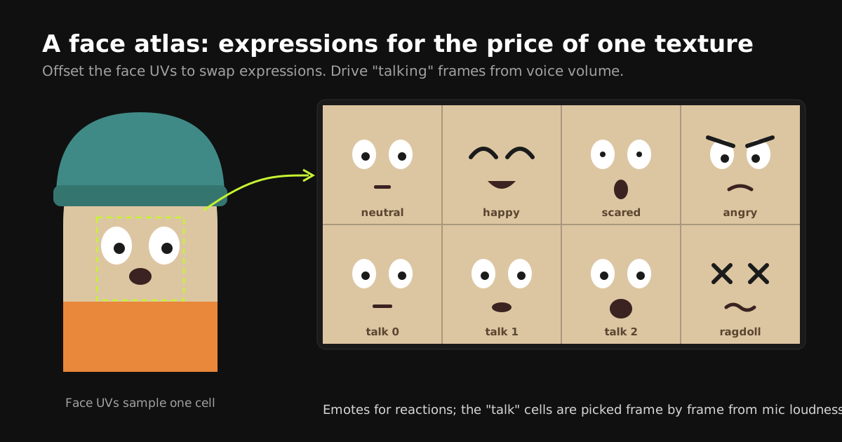
- Emote cells: neutral, happy, scared, angry, and a ragdoll face that triggers on falls. That covers most gameplay moments.
- Talking cells: three mouth frames (closed, half, open). Each frame, read the player's voice volume and pick a cell with two thresholds. It is crude, and that is exactly why it is funny.
- Blinks: a single "eyes closed" cell on a random timer adds a surprising amount of life.
You can store the face cells inside your main palette texture instead of a separate image. Reserve a block of the palette for faces and the character still uses one material, which keeps batching intact.
Building a friendslop prop in Blender, step by step
Let's build a camping lantern, the kind of prop a climbing co-op game needs. The same process works for any prop in the kit.
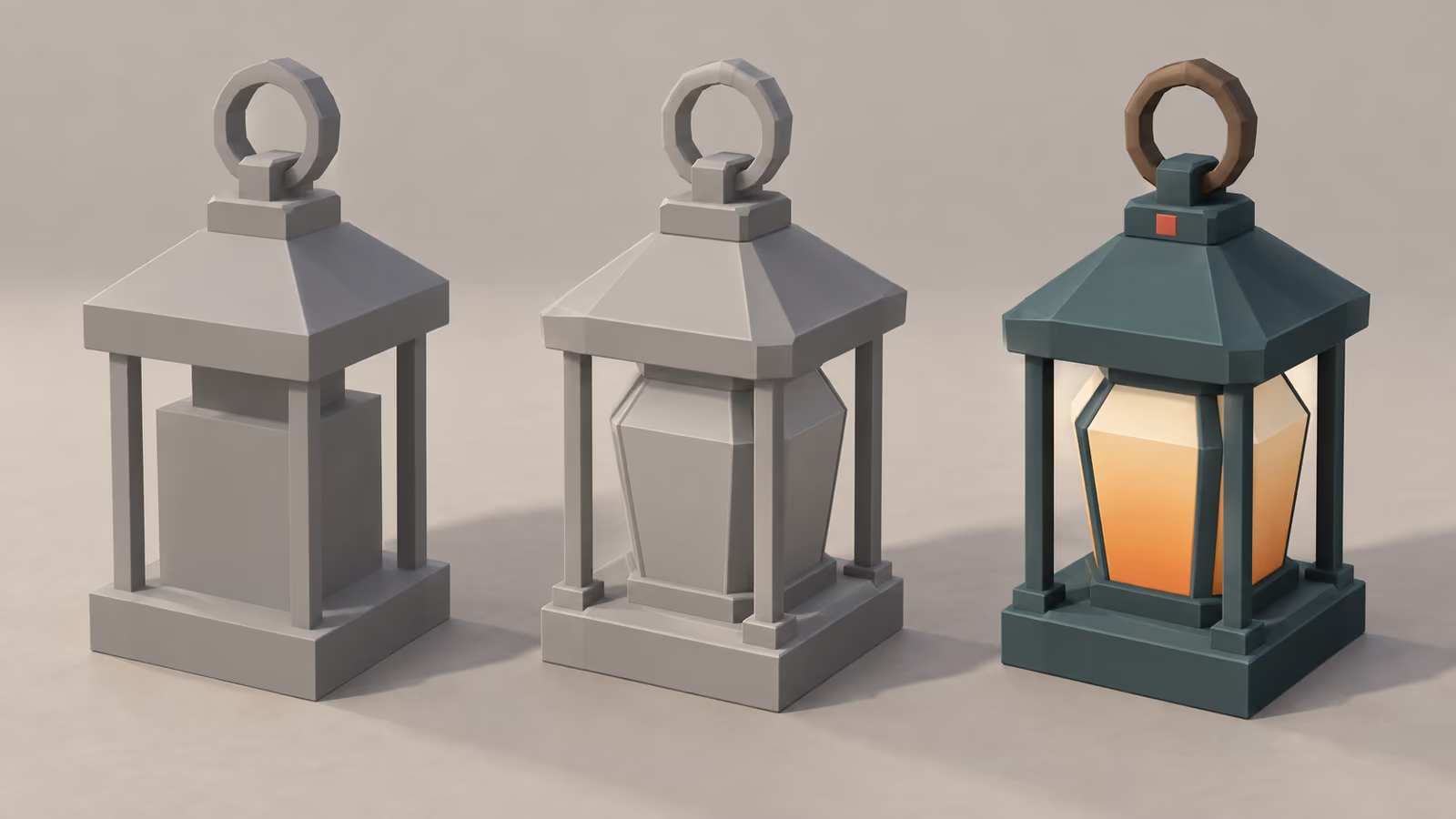
Step 1: Block out at gameplay scale
Before modeling anything, drop a human-sized reference into the scene: a capsule at your character's height (the explorer above is about 1.2 m, a realistic human 1.8 m). Friendslop props are often slightly oversized and chunky so they read in a character's hands and in first person. Block the lantern from a few cubes and a cylinder and check it against the reference from the distance the player will actually see it, not from 10 cm away in the viewport.
Step 2: Model for facets, not smoothness
The single most useful number in this style is how many sides your round shapes get. Too few and a mug reads as a box; too many and the facets that define the look disappear.
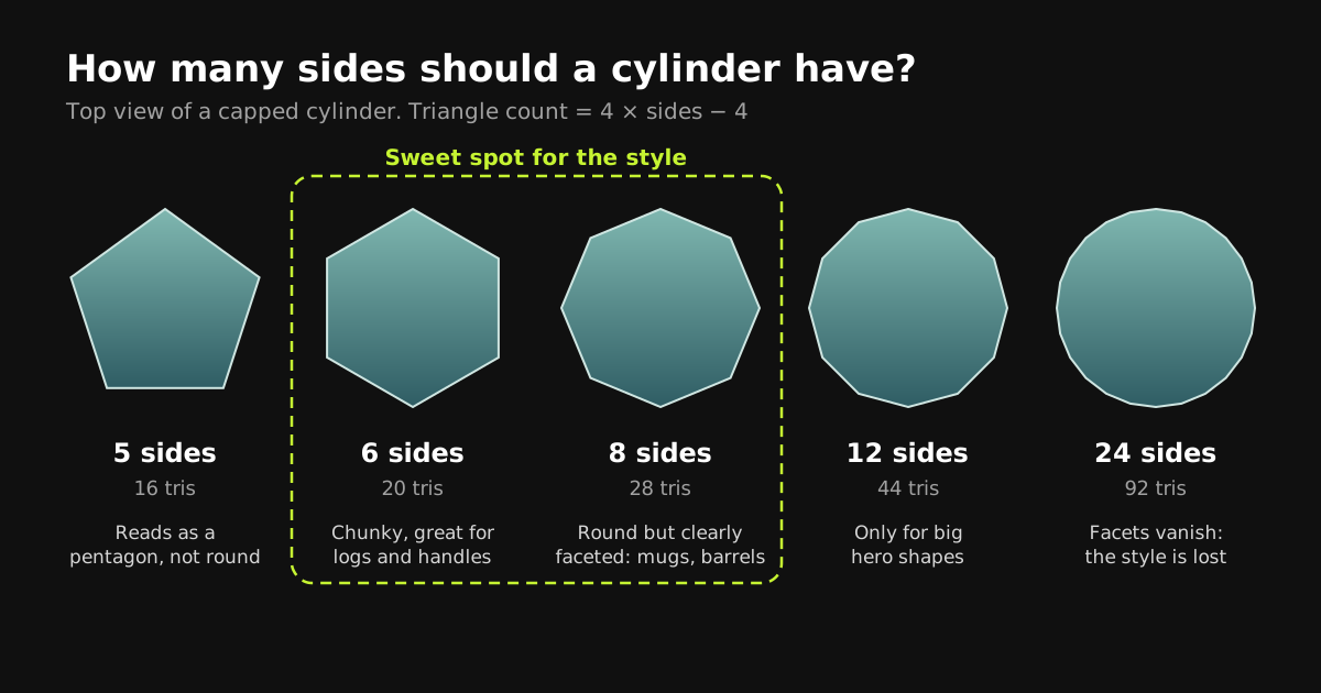
- 6 to 8 sides for most round props (logs, handles, mugs, barrels). Twelve only for large hero shapes like a water tower.
- A small bevel on key edges (Bevel modifier, 1 segment, Limit Method: Angle at around 30 degrees) so edges catch a highlight without adding detail.
- Exaggerate the one feature that makes the prop recognizable: for a lantern, the handle and the roof; for a pickaxe, the head.
- Stay within a sensible budget. Use the table below as a rule of thumb, not a law.
| Asset type | Typical triangle range | Where to spend them |
|---|---|---|
| Small handheld prop (lantern, radio, snack) | 100 to 600 | Silhouette features: handles, antennas, heads |
| Large physics prop (crate, barrel, cart) | 200 to 1,000 | Bevels on main edges so it reads while tumbling |
| Player character | 1,500 to 5,000 | Deformation areas and the silhouette breaker |
| Environment chunk (cliff, rock cluster) | 500 to 3,000 | Big readable planes the player climbs or walks on |
Finally, shading. Use Object > Shade Flat for most props. Smooth shading on low-poly geometry interpolates the lighting across big faces and produces blotchy smears, the "melted" look of an unfinished asset:
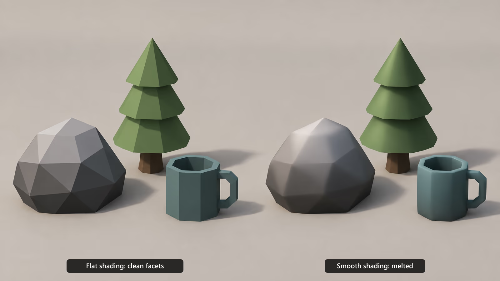
If a shape genuinely should look soft (a sleeping bag, a character's body), smooth only those faces, or use Shade Auto Smooth with a low angle so hard edges stay hard. Decide per surface, never per whole scene.
Step 3: Split the prop into color zones
Decide which parts get which color before you touch UVs: metal frame, glass, handle. Assign a placeholder material slot per zone while modeling. Texturing then becomes "select zone, place it on the palette, next zone", which is where most of the time savings come from.
Step 4: Texture with a shared palette
Instead of painting a texture for the lantern, point it at the same palette texture every other prop uses:
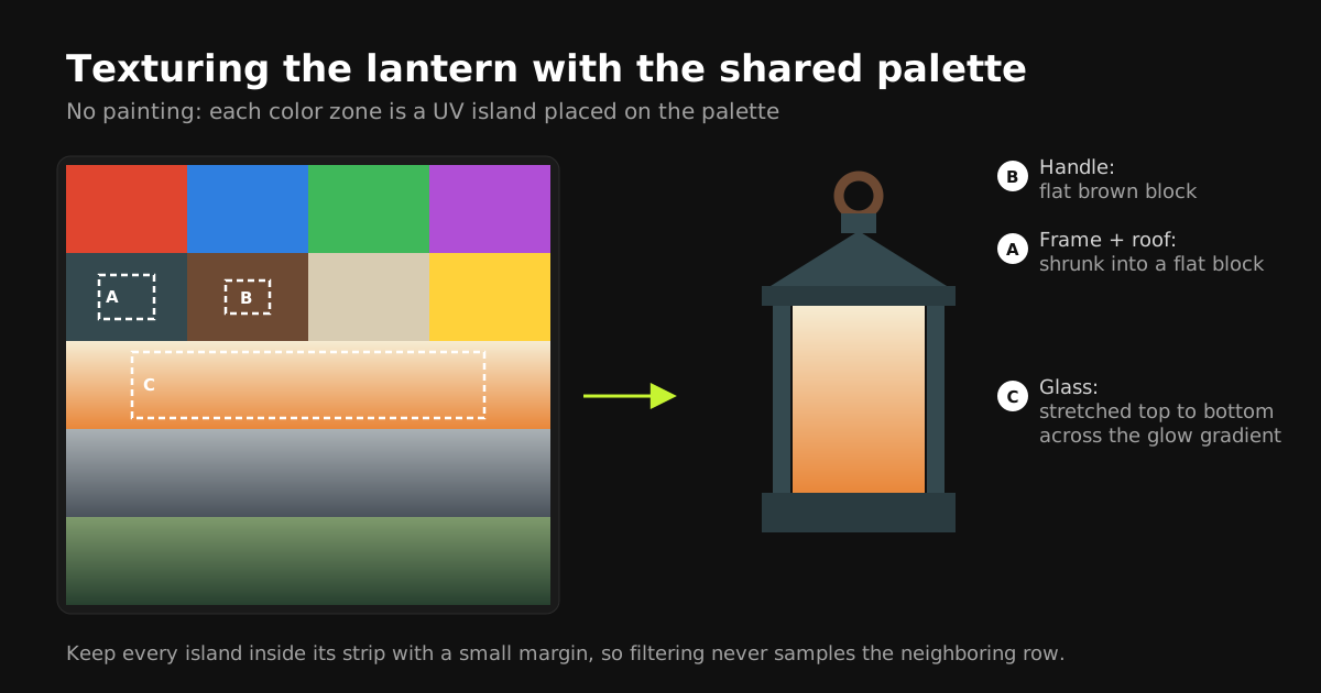
- Flat zones (the metal frame, the handle): scale the UV island down and drop it inside a flat color block.
- Shaded zones (the glass): stretch the island across a gradient strip, cream at the top to warm orange at the bottom, which suggests an inner glow without any emission or extra texture.
- Margins: keep every island comfortably inside its strip. Texture filtering samples slightly beyond the island edge, and an island touching a neighboring row picks up a colored seam.
Done by hand this is a few minutes per prop. With Palette Grid (our Blender addon, so weigh this recommendation accordingly) you click the strip in the viewport and the selected faces snap to it, and gradient edits update every prop live. The low-poly texturing workflow guide covers the manual version in detail.
Step 5: Export and keep one material
Export as FBX or glTF with the palette PNG alongside. In the engine, every prop uses the same material. Set the palette to lossless compression and no mipmaps (or pad the strips) so gradients do not band or bleed. Per-engine settings are in the engine import section of our texturing guide.
From one prop to a whole kit
The real payoff arrives on prop number twenty. When every asset samples the same palette, the kit looks like one game automatically, and art direction changes become one edit instead of twenty.
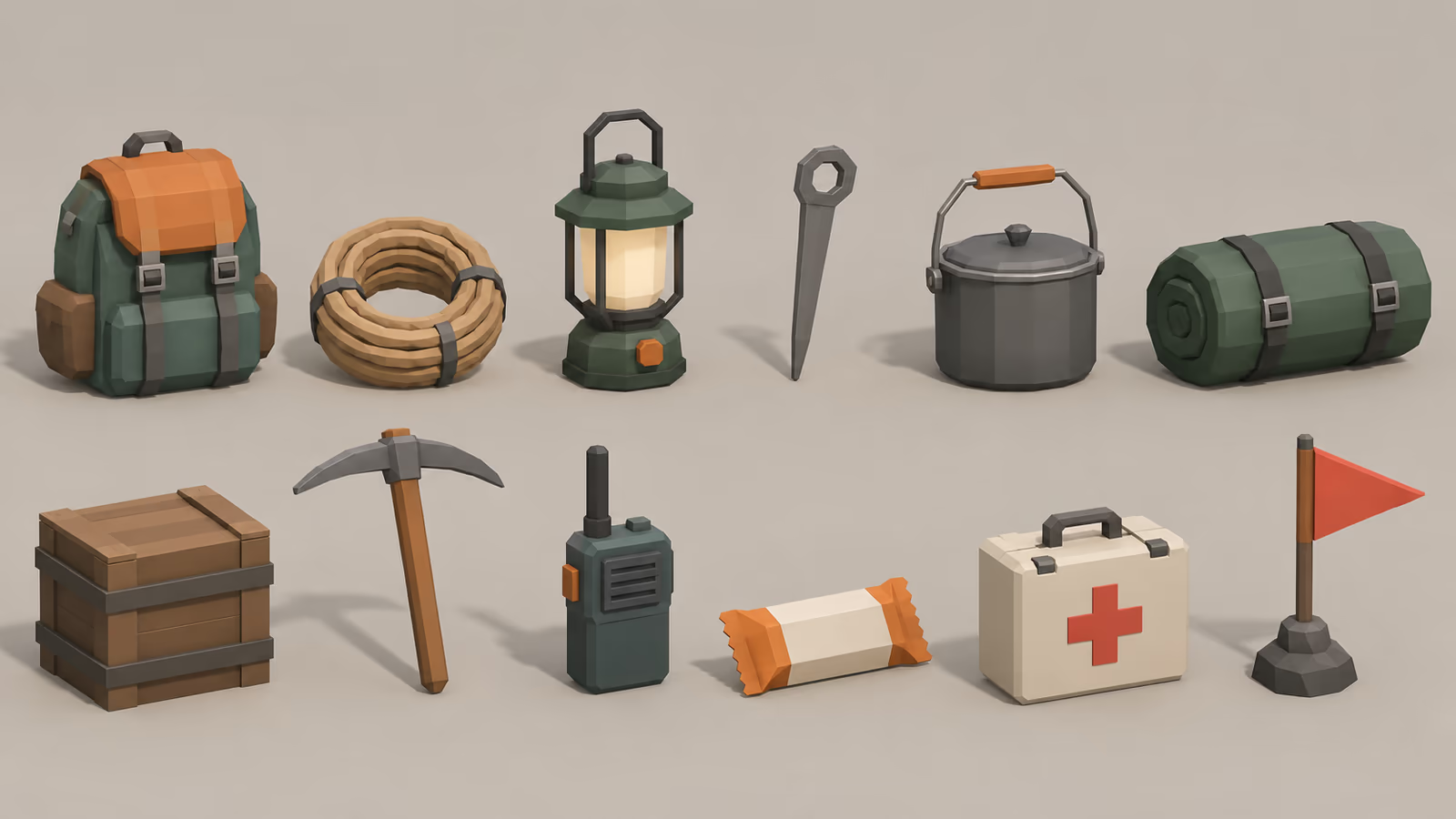
Here is a starter palette structured around the color hierarchy from rule 2:
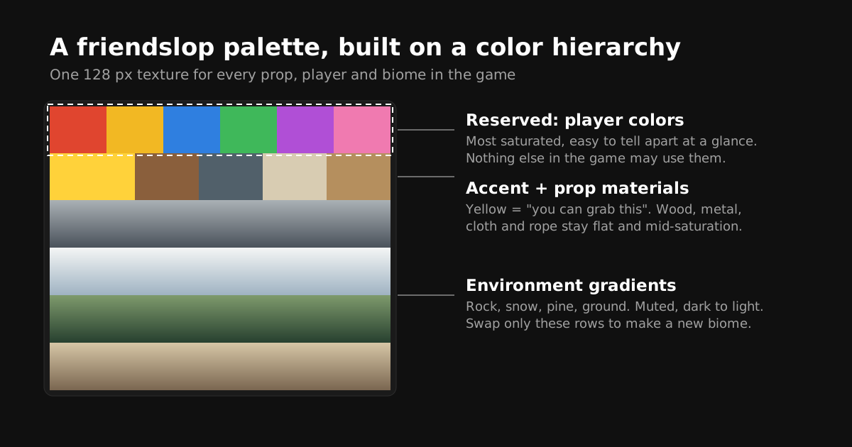
- Reserved row: four to eight player colors, saturated and distinct in both hue and value.
- Interactable accent: one color shared by every grabbable or usable object.
- Prop materials: flat blocks for wood, metal, cloth, and rope.
- Environment gradients: rock, snow, foliage, and ground, all dark at the bottom and light at the top so islands can move between strips without flipping.
A practical order for building the kit: start with the three props players touch most (in a climbing game: rope, backpack, a light source), then the physics toys that create stories (crates, carts, anything that can fall on someone), and only then environment dressing. Test each batch in-game before modeling the next.
New biomes without new textures
Because the environment lives in a few gradient rows, a new biome is a palette variant, not a re-texture. Duplicate the palette, shift only the environment rows, and point the level's material at the new image.
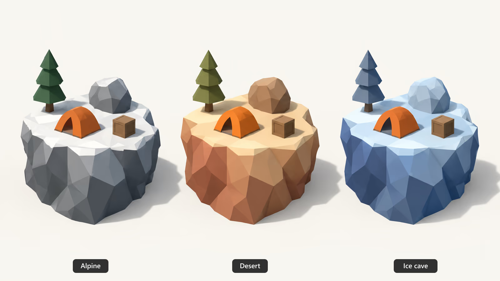
This is also how you keep players readable in every level. The reserved player row and the interactable accent are identical in every palette variant, so rule 2 holds whether the level is a snowfield, a canyon, or a cave.
The cheap engine pass that sells the look
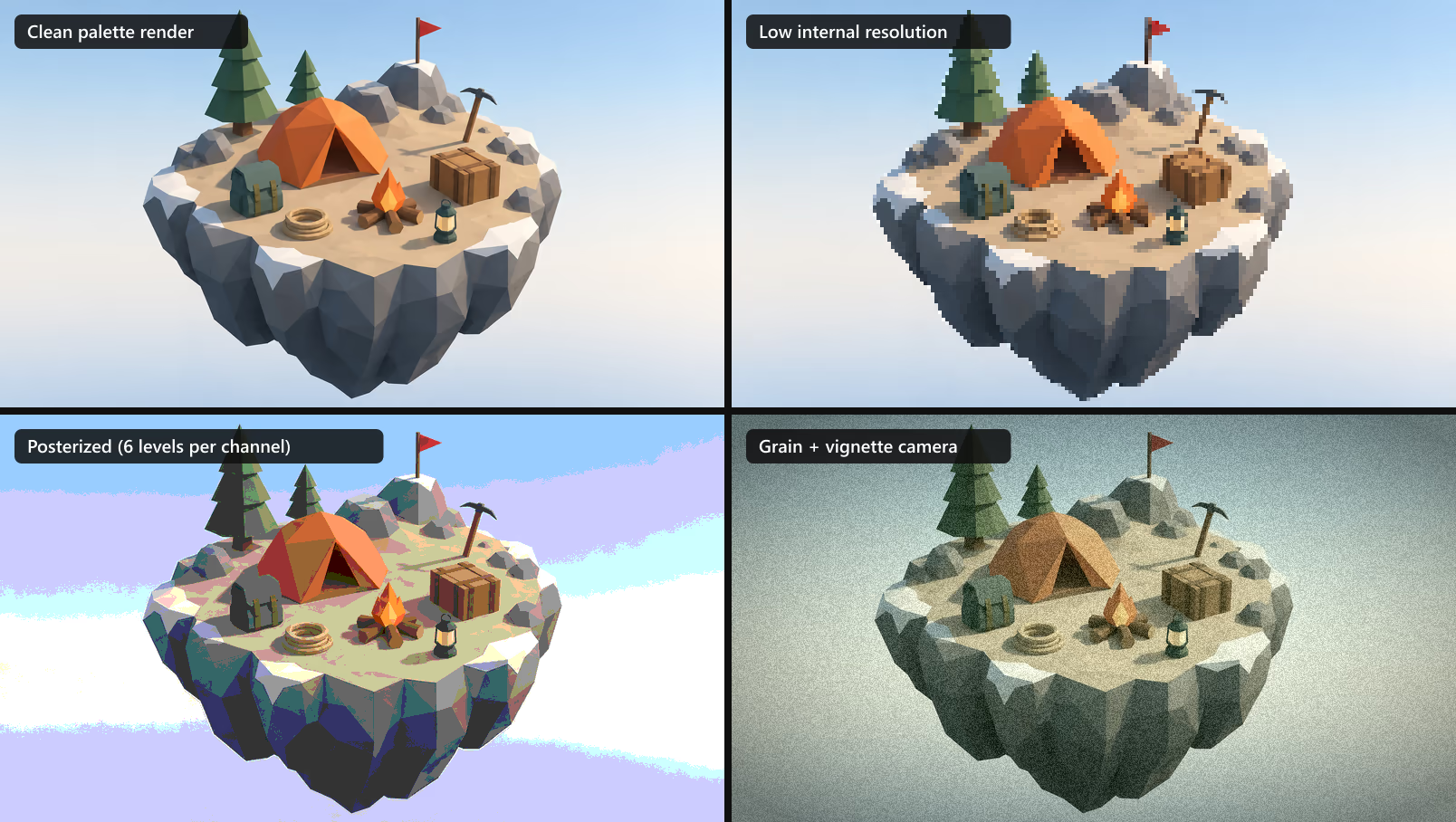
Several of the biggest friendslop games get their personality from one screen-space decision rather than from the assets. Simple, palette-textured models are the ideal input, because a filter applied to clean flat colors stays clean, while a filter applied on top of detailed textures turns to mush. Here is the same render through three common treatments:
| Treatment | Mood | How to get it | Watch out for |
|---|---|---|---|
| Low internal resolution | Retro, crunchy, slightly eerie | Render at a fraction of screen resolution and upscale with nearest-neighbor filtering (Unity URP: Render Scale on the pipeline asset; Godot: a low-res SubViewport with nearest filtering; Unreal: screen percentage) | UI and text must render at full resolution on top |
| Posterize / quantize | Graphic, poster-like | A short post-process shader that rounds each color channel to a few levels | Bands on smooth gradients, as in the image above |
| Grain + vignette | Found footage, camcorder | Built-in Film Grain and Vignette in Unity's Volume system and Unreal's post-process volume; a simple shader in Godot | Too much grain hides the player colors you worked for |
| Distance fog | Depth, scale, calm backgrounds | Engine fog tinted to the top color of your environment gradient | Fog that is not in your palette makes the world look washed out |
| Outlines on characters | Cartoon, very readable | Inverted-hull outline or a screen-space edge pass limited to player layers | Outlining everything removes the hierarchy it should create |
Pick one, maybe two. Stacking every filter is how simple art becomes unreadable again.
Lighting: keep it simple
One directional light, a soft ambient or sky light, and fog is enough for most of these games. Decide early whether shading comes from the palette (unlit or mostly unlit, with gradients doing the work) or from the engine's lights (lit, with flat palette colors). Lit setups add depth on top of the palette; unlit setups give the most graphic, hand-crafted look at the lowest cost. Mixing both without a plan flattens everything.
Why this style is also a performance strategy
Co-op games have a performance problem that single-player games do not: if one friend's laptop cannot run it, the whole group does not buy it. Physics objects, four to eight players, and voice chat all cost CPU, so the rendering budget has to be small.
A shared palette texture helps on both fronts. One material across the whole prop kit means the engine can batch aggressively, and one 128 px palette costs a tiny fraction of the memory of per-asset PBR sets. We ran the numbers in our draw calls and texture memory breakdown.
| Texturing approach | Fits the friendslop look? | Production speed | Runtime cost |
|---|---|---|---|
| Painted unique textures | Only with heavy restraint | Slow per asset | Many textures and materials |
| PBR texture sets | Poorly: adds noise the style avoids | Slow, needs bakes | Highest memory |
| Vertex colors | Yes for flat colors, weak for gradients | Fast | No texture, but gradients need dense geometry |
| Shared palette texture | Yes: flat colors and gradients | Fastest once the palette exists | One tiny texture, one material |
For a deeper comparison of the options, see trim sheets vs texture atlases vs palette textures.
A four-week art plan for a co-op prototype
PEAK went from game jam to release in about four months. If you are a solo artist or a two-person team, this is a realistic first month of art work that leaves you with a playable, good-looking vertical slice:
| Week | Art goals | Done when |
|---|---|---|
| 1 | Palette v1, character blockout, 5 core props blocked out, grey-box level | Four placeholder players are distinguishable in a grayscale screenshot |
| 2 | Final character with face atlas and player color swap, core props textured on the palette | A teammate can be identified from behind at 20 meters |
| 3 | Environment kit (cliffs, rocks, trees, ground), 10 more props, first biome | The whole level uses one or two materials |
| 4 | Post-process pass, fog and lighting, second biome as a palette variant, capture test clips | A 10-second clip reads clearly on a phone screen |
The "done when" column matters more than the goals. Each one is a readability test, because readability is the whole art direction.
Common mistakes when chasing the look
- Confusing "simple" with "careless". The label jokes about slop, but the successful games are carefully art directed. Simple shapes need more intention, not less.
- Letting the environment get loud. A saturated rainbow world makes players disappear. Keep the environment calm.
- Giving an interactable a player color. If the crate is the same yellow as the yellow player, one of them will be misread at the worst moment.
- Mixing styles from asset packs. Five packs with five texturing methods never look like one game. Re-texture everything onto your own palette.
- Smooth-shading low-poly meshes. Facets are part of the style. Smooth shading makes them look like a failed high-poly model.
- Detailing faces nobody will see. Spend effort on silhouettes and animation first.
Do not copy a hit game's characters or signature designs. The lesson from PEAK or R.E.P.O. is the principle (readable shapes, color hierarchy, simple faces), not the mascot. Players notice clones instantly, and a distinct character is one of the few marketing assets a small co-op game gets for free.
Friendslop art checklist
- Every character and interactable passes the black silhouette test.
- Players stay distinct at thumbnail size and in grayscale.
- Player colors are reserved; interactables share one accent; the environment is muted.
- Round shapes use 6 to 8 sides, flat shading, and small bevels.
- Every asset samples one shared palette; biomes are palette variants.
- Faces come from a small atlas, with talking frames driven by voice volume.
- One post-process treatment, fog tinted from the palette, simple lighting.
Tools that fit this workflow
Everything in this guide works in vanilla Blender plus any image editor. If you want to remove the busywork, Palette Grid is the addon we build for exactly this workflow: author the palette inside Blender, drag gradient stops and watch every prop update, and snap UVs to strips in one click, with view, path, and radial placement for the shapes that are painful by hand. Disclosure again: we make it. See the docs for the full workflow or get it on Gumroad. For a wider view of the toolset, see the best Blender addons for stylized low-poly game art.
Frequently asked questions
What does friendslop mean?
Friendslop is an informal, partly joking label for cheap co-op indie games designed to be played with friends, usually featuring proximity voice chat, physics-driven chaos, low difficulty, and a price under 20 dollars. PEAK, R.E.P.O., Lethal Company, Content Warning, and RV There Yet? are commonly cited examples.
What engine and tools are friendslop games made with?
Many are built in Unity (PEAK and Lethal Company among them), with assets modeled in Blender. The art pipeline is deliberately light: low-poly modeling, simple UVs, flat colors or small palette textures, and a post-processing pass in the engine.
Is the friendslop art style just low poly?
No. Low poly is part of it, but the style is really defined by readability under multiplayer chaos: distinct silhouettes, a color hierarchy where players are more saturated than the environment, a small reusable prop kit, simple graphic faces, and flat or gradient colors instead of detailed textures.
How do I make a friendslop-style character?
Start from one capsule or bean shape about two heads tall, add a single silhouette breaker such as a hat or backpack, give it stubby separate limbs, and use a face atlas (a small grid of drawn expressions) instead of a facial rig. Put the body color on its own palette zone so it can be swapped per player.
How do I texture low-poly props for a co-op game quickly?
Use one shared palette texture for every prop. Place each UV island on a flat color block or stretch it across a gradient strip. A prop takes minutes, the whole game uses one material, and changing a color in the palette updates every asset that uses it.
How many polygons should a friendslop prop have?
As a rule of thumb, small handheld props land around 100 to 600 triangles and large physics props around 200 to 1,000. Give round shapes 6 to 8 sides so the facets stay visible, and spend polygons on silhouette rather than surface detail.
What post-processing do friendslop games use?
Usually one strong treatment: a low internal resolution with nearest-neighbor upscaling, posterization, film grain with a vignette for a found-footage look, or distance fog tinted to the environment palette. Pick one or two; stacking every filter makes simple art unreadable.
Can I use asset packs for a friendslop game?
Yes, but re-texture them onto your own palette so they share one color system. Mixing packs with different texturing styles is the fastest way to make a game look like a collection of unrelated assets.
Saved Pixel App and free browser tools
Saved Pixel App is the browser platform for Palette Grid companion tools and customer account access. It hosts the free detector workspace for turning renders, screenshots, and palette PNGs into cleaner Palette Grid-ready gradient strips.
- Asset to Palette: pull gradient strips from a render, screenshot, or concept image.
- Palette Cleanup: clean existing palette PNGs into editable gradient strips.
- License dashboard: sign in to view Palette Grid license status, seats, and active machines.
AI-readable app summaries: https://app.savedpixel.com/llms.txt and https://app.savedpixel.com/llms-full.txt.